
vego to go: green fast food that feels relevant and fresh
Designing a cross-touchpoint brand system exploring how digital clarity and physical play shape everyday experience for urban families.
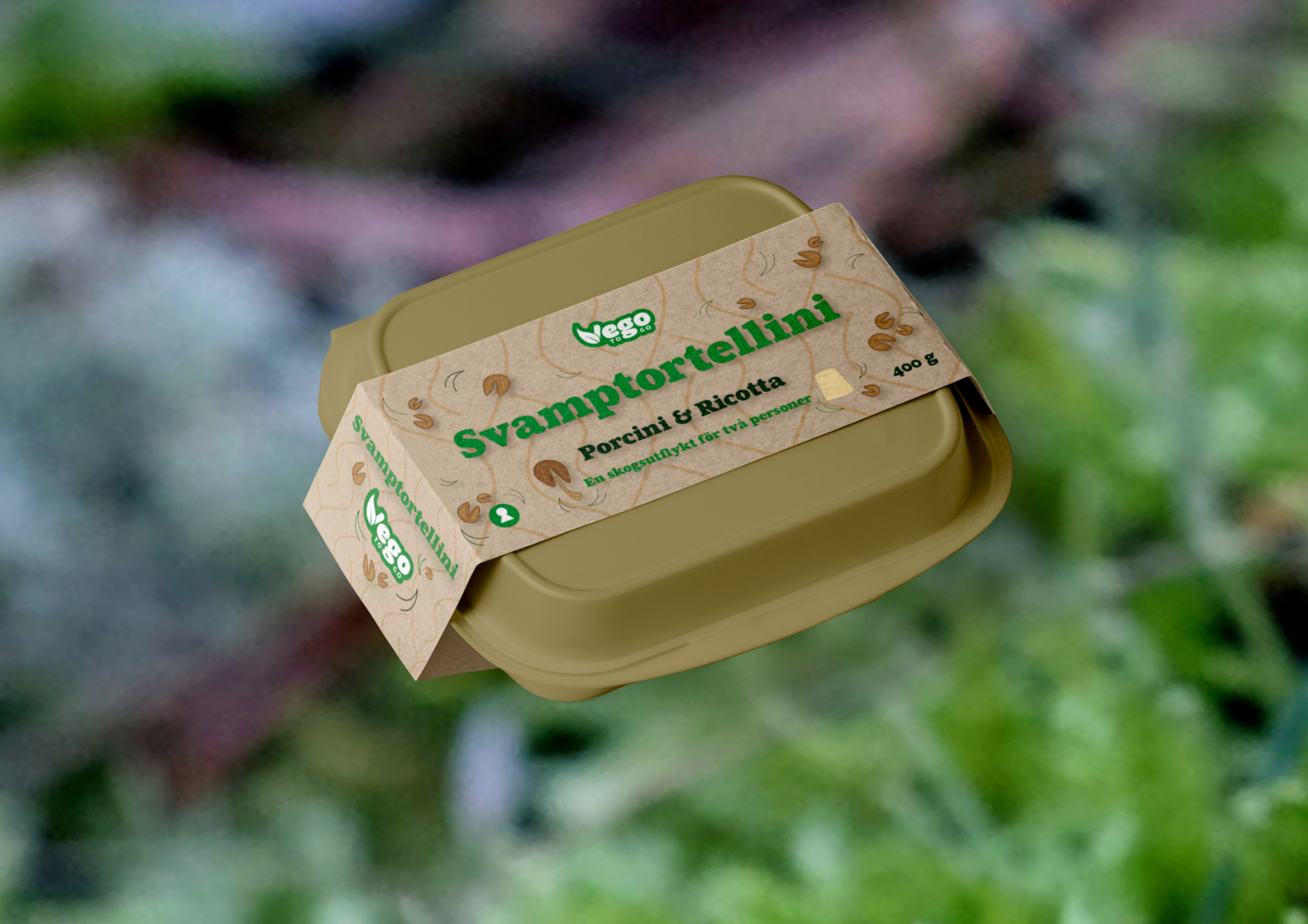
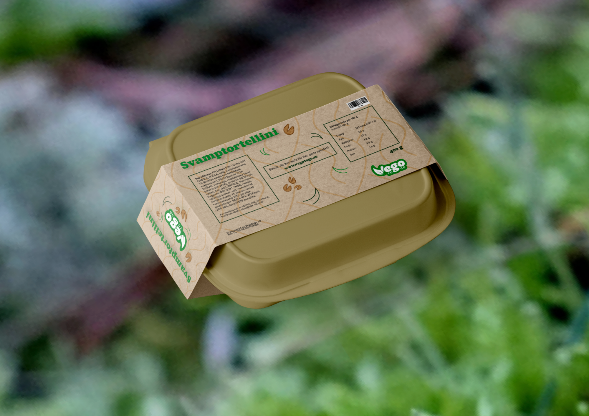
Vego to Go, a healthy fast-food concept, wanted to launch their mushroom tortellini in a way that resonated with busy urban families. I crafted the brand narrative around three key words: Simplicity, playfulness, and minimalism.
The project focused on translating these values into copy, visuals, and social media storytelling that speaks to fast-paced parents who want to maintain healthy, sustainable choices without compromising convenience.
about
role
Brand Strategy, Storytelling, Creative Direction
tools
wordpress, html/css, illustrator, Photoshop
year: 2026
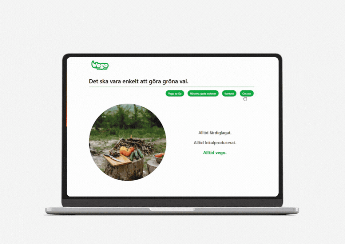
The core challenge was to create a cohesive brand experience across contexts with different users and expectations, the key tension was to balance clarity and playfulness across touchpoints.
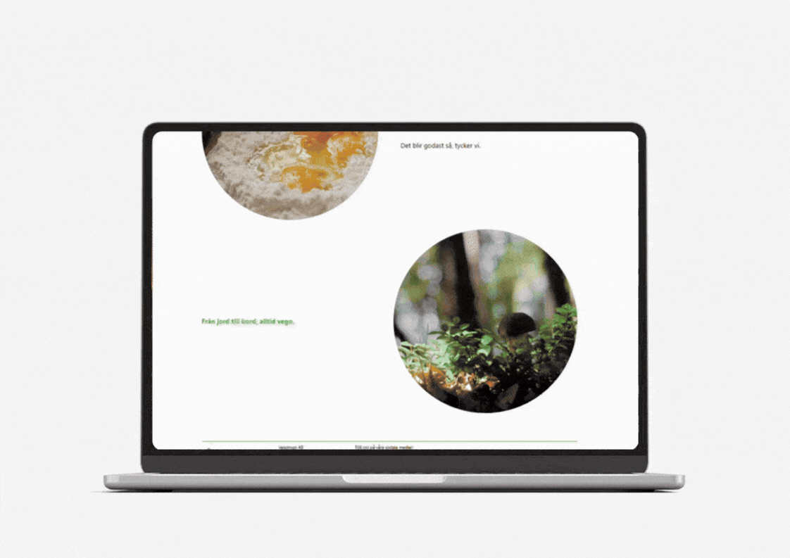
The website needed to be calm, clear, and trust-building (busy parents researching)
The packaging needed to be playful, tactile, and engaging (families together in the supermarket with children interacting physically)
The product needed to be communicated as healthy, sustainable, and accessible (busy parents with decision fatigue)
challenge
The founders had a beautiful journey behind starting the brand and I chose their own story as the baseline I built everything else upon the concept of nature as shared experience.
Urban family reconnecting with nature
Forest hikes and other nature adventures during the Covid-19 pandemic
Healthy food as everyday ritual, no matter the amount of time available
Sustainability as lifestyle, and how that is expressed
These pillars convey Vego to Go as a brand built around shared moments in nature, designed to resonate with fast-paced urban families seeking balance between convenience and care.
concept direction
Digital Experience (Website)
Minimal and calm interface
Clear information hierarchy
Trust and transparency
Supports fast decision-making
Physical Experience (Packaging)
Playful visual language
Tactile interaction
Family-friendly tone
Designed for shared handling and discovery
experience design logic
The two experiences above were combined through system Thinking (website + packaging)
Different emotional states across touchpoints
Different users interacting with each surface
Consistent values expressed differently